I was wondering if CF V8 added the ability yet to display a checkbox as a toggle / slider? I have a bunch of v7 forms that I'd like to migrate but they have toggles and I'd rather keep them looking clean and easy without having to retrain people.
Thanks!
I found a slight workaround but there's still an issue.
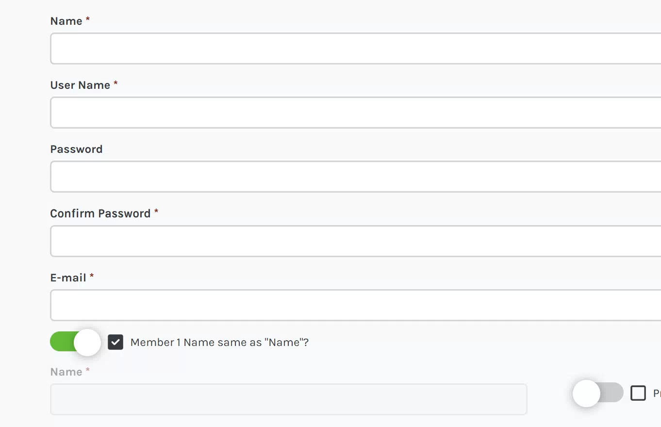
If I add this CSS, I get a great Toggle showing, but the textbox shows up next to it.
.nui.checkbox { -webkit-appearance: none; -moz-appearance: none; appearance: none; position: relative; box-sizing: border-box;}.nui.checkbox input[type="checkbox"] { position: absolute; left: 0; top: 0; z-index: 10; width: 100%; height: 100%; cursor: pointer; opacity: 0 !important;}.nui.checkbox label { position: relative; display: flex; align-items: center; box-sizing: border-box;}.nui.checkbox label:before { content: ''; width: 56px; height: 22px; background: #ccc; box-shadow: inset 0 0 0 0px #13bf11; position: relative; display: inline-block; border-radius: 20px; box-sizing: border-box; transition: 0.2s ease-in;}.nui.checkbox label:after { content: ''; position: absolute; width: 30px; height: 30px; border-radius: 50%; left: 0; top: -4px; z-index: 2; background: #fff; box-shadow: 0 1px 10px #0005; box-sizing: border-box; transition: 0.2s ease-in;}.nui.checkbox input[type="checkbox"]:checked + label:before { box-shadow: inset 40px 0 0 #13bf11;}.nui.checkbox input[type="checkbox"]:checked + label:after { left: 26px;}

Hi gotpowr
Thanks for posting your solution, if you add the following CSS then the original checkbox should disappear:
.nui.checkbox svg{
    display: none;
}
I will add this to the next update as a Checkbox style behavior
Hi Max,
Just wanted to confirm it worked perfectly! I updated my styling slightly for the toggle and it looks great in place of the checkbox. I included below in case it's helpful for you or anyone looking to do this. I got the toggle code off a github that had multiple styles.
I use green to match my template.
And thanks for the CSS element for forms allowing me to do this as a custom for now!Chris
.nui.checkbox { position: relative; height: 30px; display: flex; align-items: center; box-sizing:border-box;} .nui.checkbox input[type="checkbox"] { position: absolute; left: 0; top: 0; z-index: 10; width: 100%; height: 100%; cursor: pointer; opacity: 0;} .nui.checkbox label { position: relative; display: flex; height: 100%; align-items: center; box-sizing:border-box;} .nui.checkbox label:before { content: ''; display: inline-block; width: 54px; height: 26px; border: 1px solid #ccc; box-sizing:border-box; border-radius: 40px; transition: 0.2s ease-in; background: #f4f1f0ad; box-shadow: inset 0 0 8px #0002;} .nui.checkbox label:after { content: ''; position: absolute; top: 2px; left: 0; box-sizing:border-box; width: 26px; height: 26px; border: 6px solid #ededec; border-radius: 40px; background: #fff; box-shadow: 0 2px 5px #333; background: #028a2d; background: linear-gradient(#d5d4cd 0%, #FFF 100%); transition: 0.2s ease-in;} .nui.checkbox input[type="checkbox"]:checked + label:before { box-shadow:inset 0 0 8px #028a2d, inset 120px 0 #028a2d;} .nui.checkbox input[type="checkbox"]:checked + label:after { transform: translatex(26px);} .nui.checkbox svg{ display: none;}