Published:
There are several different kinds of form input that you can use in HTML. Text inputs and text areas are the most commonly used. After that come select drop-downs, radio buttons and checkboxes? Each of these allows the user to select one or more options from a preset range. This FAQ looks at the differences between them.
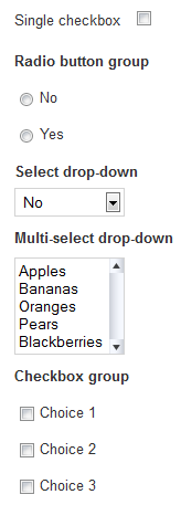 A single checkbox
The simplest input is a single checkbox. This is most often used to show agreement to terms and conditions. The single Checkbox returns an entry in the $form->data array if it checked, but no entry if it is un-checked. It's a bit harder to work with the result if there is no entry so ChronoForms offers the ability to add a Ghost entry that will set a value if the box is unchecked. The Ghost entry is enabled by default and will return and empty string ''; you can disable it, or set a different value on the Checkbox element 'Ghost' tab.
A checkbox appears in your form as a 'square' checkbox, the exact look is usually set by the brower but can be over-ridded with CSS.
A radio button group
The next simplest input is a radio button group. This includes two or more options only one of which can be selected. This means that when a radio button is clicked any other buttons in the same group are un-checked. So a radio button group will only ever return one value. There is no way to un-check a radio group once a slection is made other thatn by re-setting or re-loading the form. If no button in the group is checked then nothing will be returned. ChronoForms again offers a Ghost setting to make sure that a value is returned in this case.
Radio buttoon groups are used when only one choice is allowed from a range of options; the simplest examples are yes/no, male/female or similar choices.
If you set a default value for a radio button group then this value will be returned unless the user clicks a different button in the group.
Radio button groups appear in your form as a set of 'round' checkboxes or buttons.
A select drop-down
The select drop-down is equivalent to a radio button group in that it allows the user to make one choice from a list of options. However the options are presented as a drop-down list rather than an array of buttons to the input takes up less space in the form.
The main functional differences are that a user can un-select any choice in a select drop-down in which case it will return and empty value. It's also conventional, and often helpful, to add a first item to the list which has the value set to ''. If this is not done then you may get false returns using the first entry in the list because he user has not made a positive selection.
A multi-select drop-down
This is a version of the select drop-down with the 'multi' attribute set meaning that the user can select more than one option using Ctrl+click or Shift+click (for a block of options).
The multi-select drop-down must use an array name like name='my_choices[]' otherwise only the last entry selected will be returned. You will probably also need to add a Handle Arrays action to the form On Submit action to convert the array result into a string for use in an email or saving to a database table.
The user can also select just one, or no options from the list so these possibilites need to be managed as above.
It is usual to use the 'size' attribute with a multi-select drop-down to change the display from a list to a scrolling box - this provides a helpful visual clue that more than one option can be selected.
A checkbox group
Lastly, a checkbox group is equivalent to a multi-select drop-down. It allows the user to select, zero, one or more options from the group of boxes displayed. It also requires an array name or only the value of the last box checked will be returned.
Unlike the multi-select drop-down, if not box is checked then nothing will be returned so ChronoForms has a Ghost option as described above.


Comments