Published:
Here is a full tutorial on the new Chronoforms 5 to help you get started quickly and understand most of the features available.
A starting tutorial is also available in Italian here: chronoforms v5 guida in italiano 01
After installing the latest Chronoforms v5, please go to the forms manager using the "Chronoforms5" option under the "Components" menu.
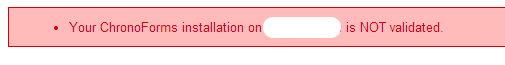
Chronoforms is a Free Joomla extension released under the GPL license, the validation is NOT obligatory, the free version has full features, but the validation will help you remove the credits link under your forms and clear the validation notice in the admin area.
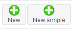 Chronoforms v5 has 2 setup modes, the normal (advanced) with full capabilities and options, and the simple setup for starters, you can create a new form in either mode, by clicking the "New" or "New simple" buttons, if you are a new Chronoforms user then we suggest that you start using the "New Simple" mode. You can switch your form setup mode later after you get used to the Chronoforms interface.
 The "Create table" button helps you create a database table for your form, this step is needed if you are planning to use the "DB Save" action to save the form data.
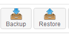
The Backup & Restore buttons should help you transfer your forms from and to your website safely.

The Install Action button will help you install extra actions to your Chronoforms.

The Demos button will load a group of demo forms which can help you understand some of the different Chronoforms features.
Note that if you click this more than once you will install more than one copy of the demo forms, you can delete or unpublish any unwanted copies.

The Settings area is for advanced users.
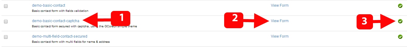
You can do different tasks in the forms list:
- Click the form name to open and edit.
- Click the "View form" link to view/run your form.
- Click the green mark to toggle the published status of your form, if the form is unpublished then it will not be accessible on the front-end.
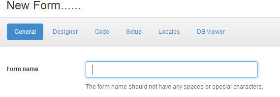
The first thing you need to do after clicking the "New" button is to write the form name, the form name should NOT have any spaces or special characters, it may only contain "-" or "_" or any alphanumeric character.
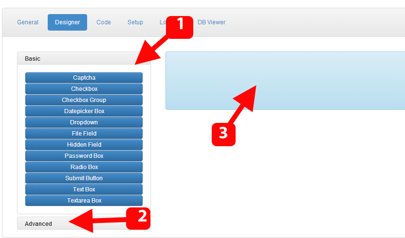
The "Designer" section is where you design your form, you can add, sort and edit form fields and other elements, there are 3 sections outlined above:
- This is the basic list of elements, you will find here the most used form fields, you can drag any of them to right blue area.
- This is the advanced list of elements, you can click the word "Advanced" to expand this section.
- This is the designer body where you can manage the form fields.

Some notes about the fields you drag to the designer body:
- The field name is written in the dark blue box at the top of the field, make sure its unique and has no spaces, and if possible, change it to something meaningful, instead of using "text1" for the "first name" field, just change it to "first_name", this will be very helpful later.
- For multiple selections fields, like check-box groups, the field name should end with 2 square brackets [], this is a common mistake, if you remove the 2 brackets then the field will not post multiple values when the form is sent.
- You can click the Edit icon to open the field details and do any desired changes.
- You can drag the fields to sort them by using the drag icon.
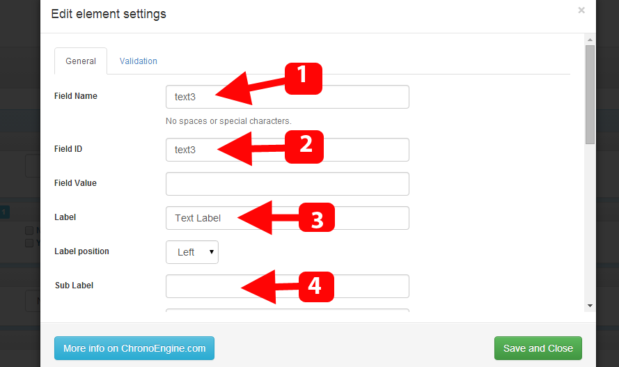
The element/field edit section has many options to change, few of the commonly used settings are:
- The field name should not be left empty and must contain a unique string with NO SPACES.
- The field id can be left unchanged, it can be used in some advanced customization like CSS styling or JavaScript references.
- The label is where you should write the field title, this is what the users are going to see beside your field.
- The sub label is another label which is displayed in a small text under the field, this is useful for providing some hints about the field.
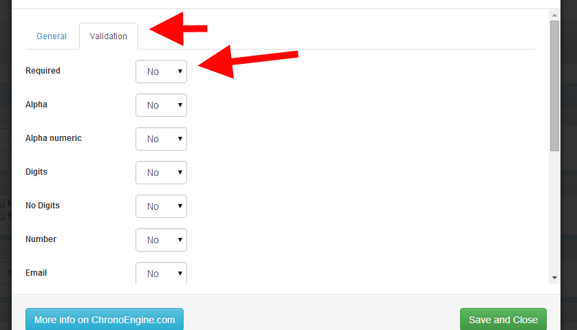
You can enable different validation rules for your field under the "Validation" tab.
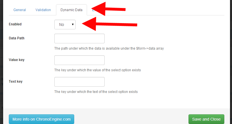
Depending on your field type, you may have more sections under the element edit panel, the Dynamic Data section should help you load your multi values/options fields with data from different sources.
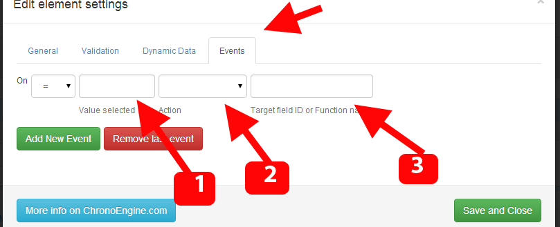
You can find the Events tab under some elements settings, it should help you assign specific events for your field based on the values selected:
- The value which when selected would trigger the event.
- The action taken when the event is triggered, this may be to show or hide another field..etc, there are multiple actions available.
- The target field id affected by this event entry.
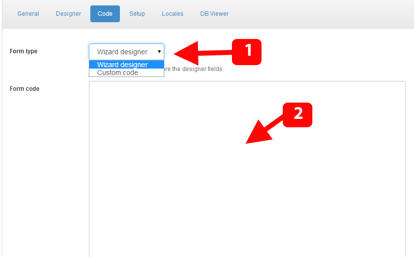
Under the Code tab, you can set your form to either use the fields created under the "Designer" section or to use a fully custom HTML code created under any HTML editor software of your choice, this is one of the first unique features presented by Chronoforms in v1 (back in 2006), and it would help you save a lot of time if you are migrating an existing form from another website quickly to Joomla, or if you have a complicated form layout which you need to just import to Joomla.
Please note that if the type is set to "Custom code" then any changes you do under the designer tab will NOT affect the form output.
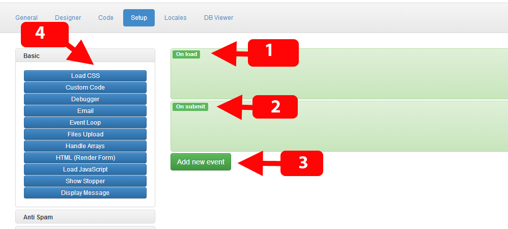
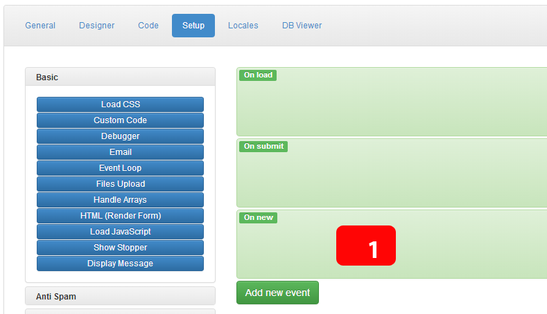
The Setup section is one of the most powerful features available for Chronoforms users, we will try to explain here how it works:
- This is the on load event, this event is triggered when the form is displayed, you can also call an event a "page", since the load event is the form page displayed when the form is loaded, please note that each event/page has a different url matching the form url but ends with &event=EVENT_NAME, however the "load" event is loaded by default if the "event" parameter is not provided.
- This is the submit event, which is triggered/processed when the form is submitted, this is the default behavior, but you can change the target submit event by playing with the HTML action settings, but this is not advised unless you have a multi page form or know what you are doing.
- The add new event button should help you add new events (pages) to your form, the new events can be accessed by using the same form url + "&event=THE_EVENT_NAME"
- The actions are the functional blocks in your form, without actions your form would be doing nothing, they are categorized based on their main functions, at the time of writing this tutorial, v5 has about 50 actions, and v4 has around 75
This image shows how a new event/page created looks like, for example, this event can now be accessed using this url: index.php?option=com_chronoforms5&chronoform=FORM_NAME&event=new
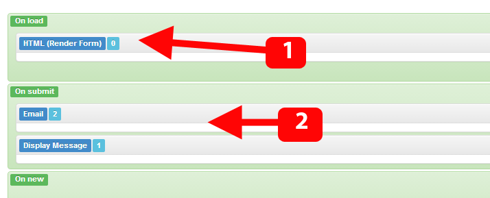
- The HTML action is the most used action, its function is to output the form code on the page, whether this code has been created using the designer or using a custom code, it will just render it, and so its usually placed under the "on load" event in order to display the form when its loaded.
- The Email action is 2nd most used action, most users want to receive emails from their forms, and this is what it does exactly, however, in order to receive any emails, you must configure the action first.
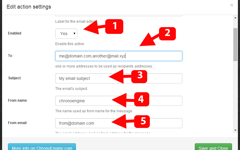
The settings covered here are obligatory for getting the email action working as expected.
- The "Enabled" option, the action must be enabled in order for it to run.
- The "To" field should contain at least 1 email address, you can add more than 1 and separate them by a comma.
- The "Subject" field should simply contain the message's subject.
- The "From name" is the from name string used in the email, you must provide a valid string here.
- The "From email" can't be left empty, and in most cases you should set this as some address @ your domain, otherwise the email may get blocked or marked as spam.
The dynamic fields allow you to use the form data as your email settings, for example, the "Dynamic to" field would accept a form field name which may hold an email address, and this address would then be used as the target address.
-
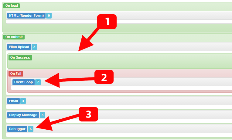
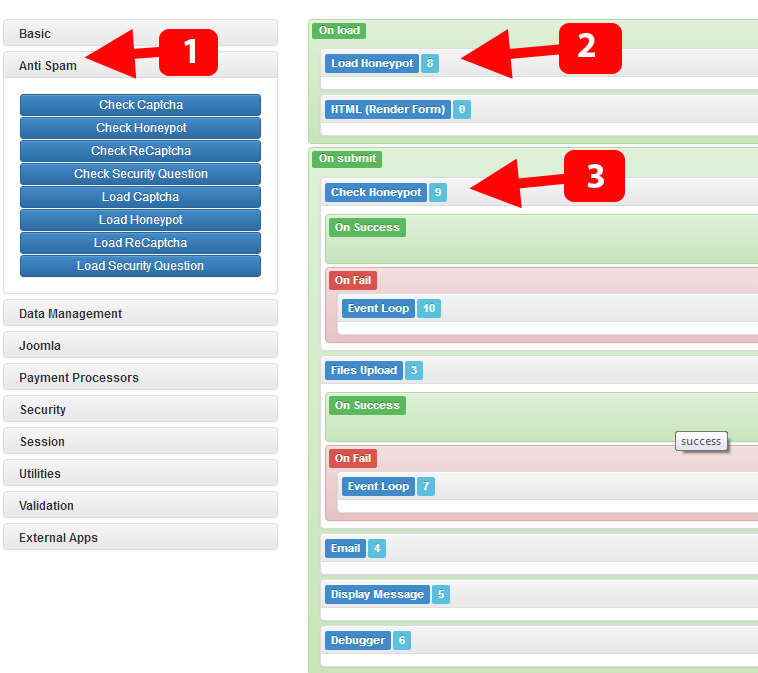
Some actions are more advanced and have their own sub events, for example, take the "Files upload" action, the "success" event is triggered when the file is uploaded successfully, but the "fail" event is triggered when the any problem occurs with the upload.
please note that sub events will not affect the main execution workflow, this means that, whether the file is uploaded successfully or not, the "submit" event workflow will continue to run to the end, unless we tell it to do something else.
- So, since we want to tell the user that there is some problem with the uploaded file, we should add an "Event loop" in the "on fail" sub event, what this action does (the Event Loop) is that it halts the execution and then triggers the "Load" event, this means that no actions after the "Files upload" are processed AND the form will be re-displayed.
- The "Debugger" action is very vital for finding problems with your form, most actions log some debugging messages which can then be displayed using the debugger action (and hence its the last action to display all the previous actions' log).
-
The "Anti spam" actions section is frequently used by Chronoforms users, Chronoforms has many anti spam tools, including the default Captcha, ReCaptcha, Security question and the Honeypot check.
The easiest one to setup is the Honeypot, all you need to do is to add the action which "loads" the honeypot, and another action to "check" the honeypot. - The load action is logically placed when the form loads, and it must be BEFORE the form is displayed (above the html action) in order to do its magic before the form output is done.
- The check action should be placed after the form is submitted (at the submit event) and it should be the first thing to run in the "submit" event, in order to block any spam attempts before any further actions are taken.
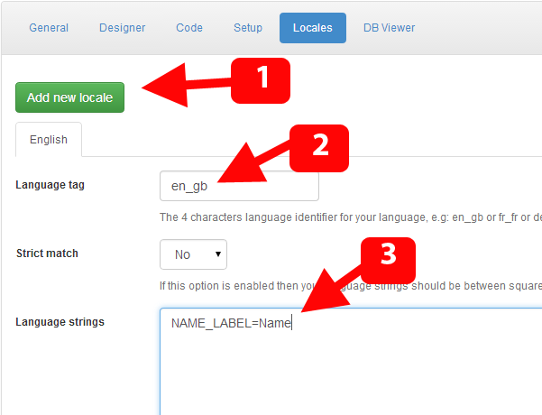
The "Locales" tab is where you add multi language support to your v5 form.
- Click the "Add new locale" button to create a new language dictionary for your form.
- Enter the language tag, which should be in the same format provided, e.g: for English en_gb and for German de_de...etc, the language code should match the one in your languages manager.
- Under the Language Strings box, just enter the form string to translate along with the translation string, so if one for your fields labels was set to MY_LABEL then you can use this: MY_LABEL=My label
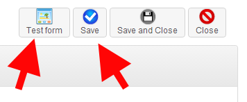
At the top right corner you can save your form at any time, and you can also Test it quickly, the test will not work if you didn't save your form or if you didn't add the "HTML" action to the "on load" event (in case you want to see the form default fields output).


Comments